
Flex Container
In the previous lesson, you saw how the browser lays out elements in normal flow: block elements stack from top to bottom, and inline elements line up next to each other like words in a sentence. But web pages are full of boxes side by side: navigation bars, rows of cards, a logo on the left and links on the right. CSS has a tool made exactly for laying out boxes like that: flexbox (short for flexible box layout).
For this lesson, we've extended our cat page: at the top, there's a navigation bar with a logo and links to the sections, the title area has a subtitle, and the list of breeds has become four cards. So far, everything is just one under another. To see the cards, scroll down in the preview. During this lesson, we'll lay the page out with flexbox.
Flexbox is turned on by the declaration display: flex on the parent of the elements we want to lay out:
.container {
	display: flex;
}
The element with display: flex becomes a flex container, and its children become flex items. The items line up next to each other in a row, from left to right. Only the children of the container become flex items, not their own children: the content inside each item is laid out as before.
Flexbox places items along two directions, called axes. The main axis is the direction in which the items are lined up one after another. In a row, it goes from left to right. The cross axis crosses it at a right angle, so in a row, it goes from top to bottom. On the left of the picture, you can see a row. On the right is a column, which you'll learn to make later in this lesson.
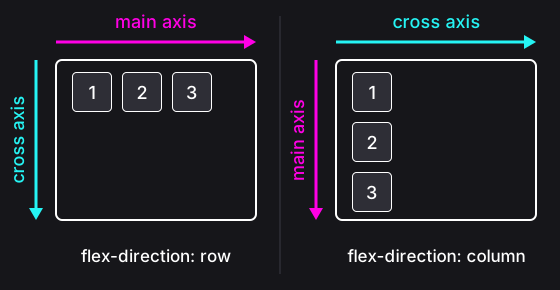
In the next exercises, the axes will help us say where the items should go.
Instructions
Start programming for free
1/8