
Direction and Centering
Next comes the title area: the div with the class title-background, which holds the main heading and a subtitle. We'd like them one under the other and centered, both horizontally and vertically.
So far, our flex items have always been in a row. The direction of the main axis is set by the flex-direction property of the flex container:
row: a row from left to right. This is the default.column: a column from top to bottom.row-reverseandcolumn-reverse: a row from right to left or a column from bottom to top, so the last item comes first.
When the direction changes, the axes turn with it. In a column, the main axis goes from top to bottom and the cross axis from left to right:
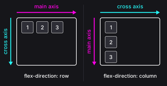
And because justify-content always works on the main axis and align-items on the cross axis, in a column, justify-content moves the items vertically and align-items horizontally. To center something both ways, you need both of them, whatever the direction:
.container {
	display: flex;
	flex-direction: column;
	justify-content: center; /* in a column: vertically */
	align-items: center; /* in a column: horizontally */
}
Centering something vertically used to be a well-known headache in CSS. With flexbox, it takes just a few declarations.
Instructions
Start programming for free
4/8