
Spanning Several Cells
The Maine Coon is one of the largest cat breeds, so let's give it a bigger card too: two columns wide and two rows tall.
An item can take up more than one cell. With the grid-column property, we say which columns it takes up, and with grid-row, which rows. The easiest way is the word span and a number:
.large {
	grid-column: span 2;
}
The item starts where it would be anyway, but it's two columns wide. The items after it move on to make room. If the item doesn't fit at the end of a row, it moves to the next one.
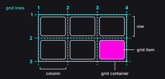
We can also say exactly where an item starts and where it ends, with the numbers of the grid lines. The lines are numbered from 1: a grid with three columns has four vertical lines, from the left edge to the right edge (see the picture). The value is then two numbers separated by a slash: the line where the item starts and the line where it ends.
.large {
	grid-column: 1 / 3;
}
This item lies between lines 1 and 3, so it takes up the first and the second column. grid-column: 1 / -1 stretches an item across the whole width of the grid: negative numbers count the lines from the end, so -1 is the last line.
The grid-row property works the same way, just for rows.
Instructions
Start programming for free
4/7