
Grid Container and Items
In the previous lesson, flexbox laid elements out in one direction: in a row or in a column. Many layouts need both directions at once, though: a photo gallery, a set of cards, or a whole page with a header, a menu, the content and a footer. For these, CSS has the grid layout, called CSS Grid. It arranges elements into rows and columns at the same time, a bit like a table.
We've prepared a new version of the cat page for this lesson. It has a header, a menu, a description and six cards with cat breeds. The cards are in a div with the class cards, and each card has the class card. For now, they are one below the other.
A grid is switched on the same way as flexbox: we give the parent element display: grid, and it becomes a grid container. Its direct children become grid items. Really only the direct children: the headings and paragraphs inside the cards are not grid items; they stay inside their cards.
Then we say what columns the grid has, with the grid-template-columns property. Its value is a list of column widths separated by spaces, and each width creates one column:
.cards {
	display: grid;
	grid-template-columns: 200px 100px;
}
This grid has two columns: the first one is 200 pixels wide and the second one 100 pixels. The items fill the grid in the order in which they appear in the HTML: from left to right, and when a row is full, they continue on the next one. The browser creates as many rows as needed, and each row is as tall as its content needs. (Rows can also be set by hand, with the grid-template-rows property, but we usually let the browser create them.)
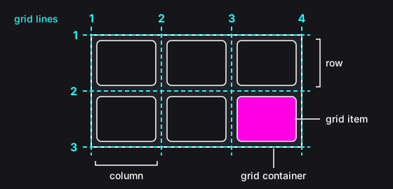
The picture shows a grid with three columns and two rows. A place where a row meets a column is called a cell, and each item takes up one cell. The numbered lines between the columns and the rows are the grid lines. We'll need them later in this lesson.
Instructions
Start programming for free
1/7