
Breakpoints
The width from which a class with a prefix applies is called a breakpoint: at that width, the layout of the page changes. Tailwind has five breakpoints, each with its own prefix:
| Prefix | From | CSS | Typical screens |
|---|---|---|---|
sm: | 40rem (640 px) | @media (width >= 40rem) | phones turned sideways |
md: | 48rem (768 px) | @media (width >= 48rem) | tablets |
lg: | 64rem (1024 px) | @media (width >= 64rem) | tablets turned sideways, small laptops |
xl: | 80rem (1280 px) | @media (width >= 80rem) | laptops and computers |
2xl: | 96rem (1536 px) | @media (width >= 96rem) | big monitors |
The names come from clothing sizes: small, medium, large and extra large. The widths are in rem, so they follow the text size the visitor has set in the browser: with bigger text, the page switches to the wider layout later, only when there's really enough room for it.
Each prefix applies from its width up, so on all wider screens too. In the picture, you can see which prefixes apply at the widths of the preview bar: at 375 px none of them, at 768 px sm: and md:, and at 1280 px all of them except 2xl:.
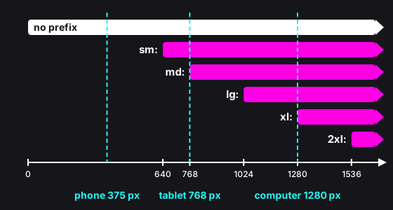
That's why one element can have several classes with different prefixes, each taking over at its own breakpoint:
<div class="grid grid-cols-1 sm:grid-cols-2 lg:grid-cols-4">One column on a phone, two from 640 px up and four from 1024 px up. At 1280 px, both sm:grid-cols-2 and lg:grid-cols-4 apply, so which one wins? The cascade decides, as you know it from the CSS course: Tailwind writes the CSS for the breakpoints from the smallest to the biggest, so the rule for the wider screen comes later and wins. The order of the classes in the class attribute doesn't matter.
Instructions
Start programming for free
2/7